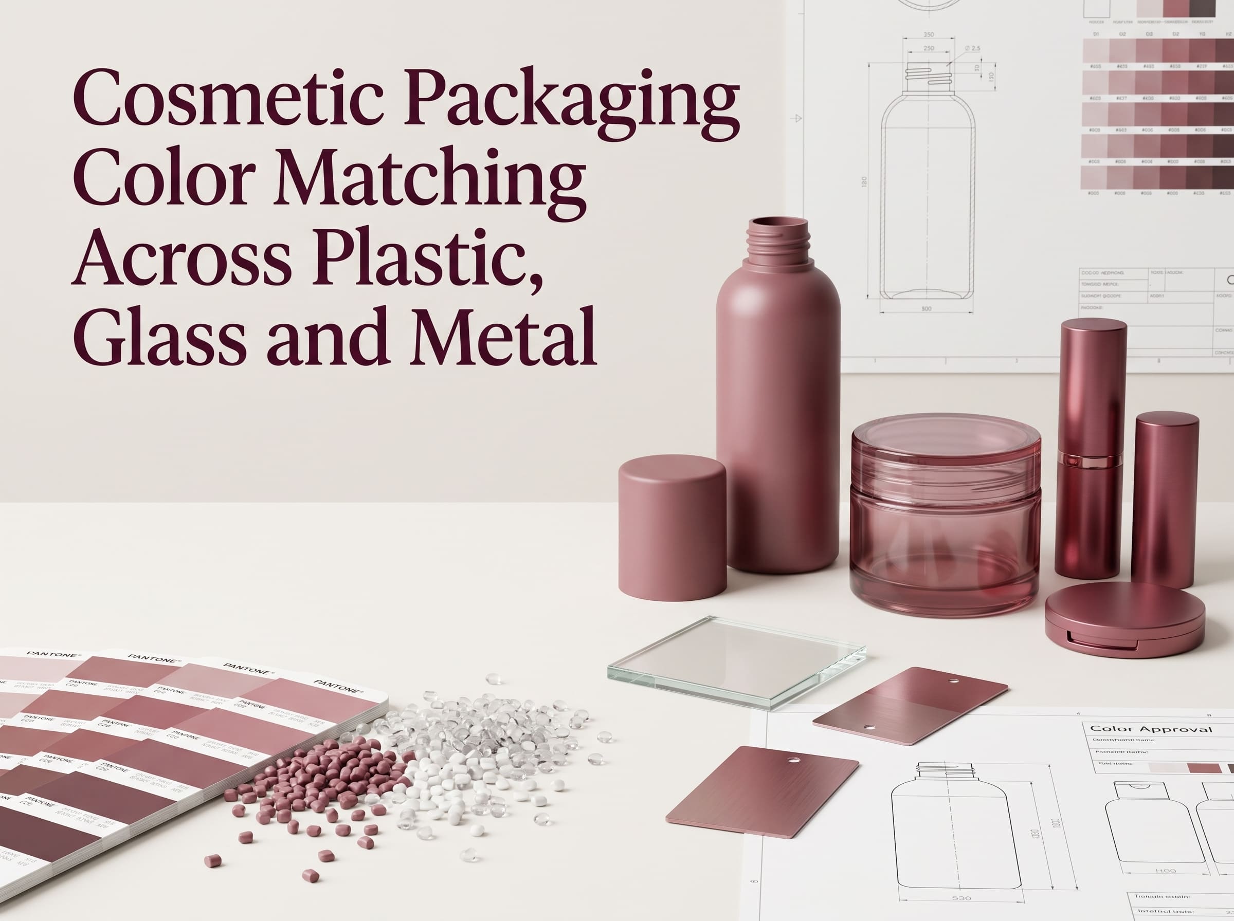
A beauty brand may approve one Pantone color and expect every component in the final packaging collection to look identical.
Then the samples arrive.
The plastic cap looks slightly warmer. The glass bottle looks darker. The aluminium sleeve reflects more light, while the sprayed compact appears softer and less saturated.
The supplier may have followed the same color reference for every component, yet the finished products still do not visually match.
This is one of the most common challenges in cosmetic packaging color matching.
Color consistency is not simply a matter of choosing the correct Pantone number. The final appearance depends on the material, surface texture, transparency, gloss, wall thickness, pigment system, decoration process and even the lighting under which the package is evaluated.
For beauty brands developing packaging across plastic, glass and metal, the real goal is therefore not always to create mathematically identical colors.
It is to create controlled visual consistency across different materials.
Why the Same Color Looks Different on Different Materials
Color is the result of how light interacts with a surface.
A matte PP cap scatters light differently from polished aluminium. Transparent PETG allows light to travel through the material, while an opaque ABS component mainly reflects light from its surface. A sprayed glass bottle may combine reflected and transmitted light.
Even when the nominal color target is the same, these different optical properties change what the eye sees.
Important factors include:
- Base material
- Material transparency
- Wall thickness
- Surface texture
- Gloss level
- Pigment concentration
- Coating thickness
- Metallic reflection
- Background color
- Lighting conditions
This is why a color approved on paper cannot automatically predict the appearance of the final package.
Pantone provides an extremely useful common language for design and production. Brands can learn more about professional color systems through the Pantone website. However, a Pantone reference should normally be treated as the starting target, not the only production standard.
Plastic Color Matching: More Than Adding Masterbatch
Plastic cosmetic packaging is commonly colored by adding masterbatch or pigments to the resin before moulding.
Materials such as PP, PET, PETG, ABS and HDPE have different natural appearances.
Some resins are naturally clearer. Others have a milky or slightly warm base tone. This influences the final color.
For example, the same pigment formulation may appear different in:
- Opaque PP
- Clear PET
- Transparent PETG
- High-gloss ABS
Wall thickness also matters.
A translucent color may appear much deeper in a thick cosmetic jar than in a thin bottle wall. Two components made from the same material and masterbatch can therefore still appear different if their geometry is very different.
Mould texture creates another variable. A polished cavity can produce a glossy surface with stronger saturation, while a textured mould creates more diffuse reflection and may make the same color look softer.
For this reason, plastic color approval should ideally use the actual production material and representative component geometry.
A flat plastic chip is useful for early development, but it should not replace approval of the final moulded sample.
Why Glass Creates a Different Color Effect
Glass packaging introduces another layer of complexity.
The visible color may come from:
- The glass itself
- A sprayed coating
- A translucent coating
- An opaque coating
- Frosting
- Printing
- Metallization
Clear glass also has its own slight inherent color depending on composition and thickness.
When a translucent color coating is applied, the final appearance is influenced by both the coating and the glass beneath it. A thick glass base may look noticeably darker than the thinner walls of the same bottle.
The product formula can also influence appearance after filling.
A transparent serum, milky lotion or strongly colored liquid may change how a translucent bottle is perceived.
For this reason, brands should evaluate transparent or semi-transparent packaging both empty and filled with a representative formula whenever the contents will remain visible.
Metal and Metallic Finishes Behave Differently Again
Aluminium presents a different challenge because the surface reflects light much more strongly than ordinary opaque plastic.
The same target color may appear brighter, deeper or more dynamic depending on whether the aluminium is:
- Polished
- Brushed
- Anodized
- Spray coated
- Lacquered
- Sandblasted
Brushed aluminium creates directional reflections. Polished metal creates stronger highlights. Matte coatings reduce those reflections and make the color appear more stable under changing viewing angles.
Metallic plastic finishes create similar challenges.
Vacuum metallization, pearl pigments and metallic spray coatings produce colors that change with light and viewing direction. These finishes cannot always be judged using the same expectations as a solid opaque color.
For more on these processes, see Her Beauty’s guide to metallic cosmetic packaging finishes.
When a brand combines a plastic bottle with an aluminium cap, the correct target may not be two physically identical colors.
The better objective may be for the two components to look intentionally coordinated when assembled.
Pantone Is a Reference, Not the Final Golden Sample
A common packaging brief may simply state:
Pantone 186 C
That provides a useful direction, but it leaves several questions unanswered.
Should the surface be glossy or matte?
Is the color opaque or translucent?
Will it be produced through masterbatch, spray coating or anodizing?
Which substrate will be used?
Under which light should the sample be approved?
Because of these variables, professional cosmetic packaging development usually needs a physical reference after the initial color-development stage.
This approved physical reference is often called a:
- Golden sample
- Master sample
- Approved standard
- Limit sample
Once approved, the physical sample becomes much more useful for production control than a digital image displayed on a monitor.
Screens, cameras and photography can significantly distort color. Final approval should therefore not rely on photos alone.
Using Instrumental Color Measurement
Visual approval remains important, but instrumental measurement can improve consistency.
A spectrophotometer can measure color numerically rather than relying only on human judgment.
A widely used color system is CIELAB, which describes color using three coordinates:
- L* – lightness
- a* – red to green axis
- b* – yellow to blue axis
The difference between two measured colors can then be expressed using a Delta E value.
The International Commission on Illumination (CIE) develops internationally recognised systems for colorimetry and color measurement.
However, Delta E should not be treated as a universal pass-or-fail number for every cosmetic package.
A suitable tolerance depends on:
- Material
- Surface finish
- Measurement geometry
- Gloss
- Transparency
- Metallic effect
- Brand requirements
A highly controlled opaque plastic component may support a tighter numerical tolerance than a pearl metallic or translucent finish.
For metallic surfaces in particular, visual evaluation remains essential because the appearance changes according to viewing angle and reflection.
Why Controlled Lighting Matters
A package that matches under factory lighting may look different in a retail store.
This phenomenon can be related to metamerism, where two samples appear similar under one light source but different under another.
Color review should therefore take place under defined lighting conditions.
Common evaluations may include:
- Standard daylight
- Retail lighting
- Warm indoor lighting
Brands should establish a primary approval light source and use it consistently between the brand, packaging supplier and decoration factory.
Natural daylight can also be useful as a secondary visual check, but uncontrolled sunlight should not be the only approval method because its intensity and color temperature constantly change.
Matching a Complete Beauty Collection
The challenge becomes greater when one product range includes several substrates.
A typical beauty collection might contain:
- PETG skincare bottle
- PP cream jar
- ABS compact
- Aluminium lipstick tube
- Glass serum bottle
- Synthetic makeup brush handle
Trying to force every component to use exactly the same pigment formulation is unlikely to produce the best visual result.
Instead, the development team should establish a visual color family.
For example, a warm beige plastic bottle may need a slightly adjusted spray formulation on glass and a separate anodized tone on aluminium so that the assembled collection appears consistent.
The formulations are different.
The perceived brand color is consistent.
This is one reason Her Beauty’s turnkey supply-chain service can be useful for projects involving several packaging and beauty-tool categories. Coordinating color standards across suppliers helps reduce the risk of receiving components that are technically correct individually but visually inconsistent as a collection.
A Practical Color-Matching Process
For a new cosmetic packaging project, a structured workflow can reduce repeated sampling.
1. Define the Color Target
Provide the Pantone reference, physical reference product or approved color chip.
Also define:
- Gloss level
- Transparency
- Texture
- Metallic or pearl effect
- Desired visual mood
2. Confirm Every Substrate
Identify whether each component is PP, PET, PETG, ABS, glass, aluminium or another material.
Do not assume one color formula can be transferred directly between them.
3. Produce Representative Samples
Develop colors on components that are as close as possible to the final production structure.
For private mould projects, Her Beauty’s custom mould development service can support prototyping and off-tool sample evaluation before mass production.
4. Compare Components Together
Do not approve the cap, bottle and decoration independently.
Assemble the package and place the complete product range together.
A small difference that appears significant when two chips are placed side by side may become acceptable in the final design—or the reverse.
5. Establish a Golden Sample
Once approved, retain signed production-standard samples for the brand and supplier.
These should become the physical reference for future batches.
6. Control Mass Production
Production color should be evaluated against the approved standard using defined visual and instrumental criteria where appropriate.
If the resin, pigment, coating supplier or process changes, color should be reviewed again.
Common Color-Matching Mistakes
Approving Color From a Screen
Digital renderings are useful for design but should not serve as final color standards.
Comparing Different Materials as Flat Chips
The actual component geometry, thickness and finish may change color significantly.
Ignoring Gloss
A glossy black and matte black can appear like different colors even when their pigment formulation is similar.
Approving Components Separately
Beauty packaging is experienced as a complete product. Always evaluate the assembled package and, where relevant, the full product collection.
Changing Materials Without Reapproval
Moving from virgin plastic to PCR, changing resin grade or replacing a coating system can affect color and appearance.
Frequently Asked Questions
Can different packaging materials match the same Pantone color exactly?
They can often be made visually close, but identical appearance is not always realistic because plastic, glass and metal interact with light differently. Visual coordination is often more important than forcing identical numerical values.
What is a golden sample?
A golden sample is the approved physical color and appearance standard used to compare future production batches.
Is Delta E enough for cosmetic packaging color approval?
No. Instrumental measurement is useful, but surface texture, transparency, gloss and metallic reflection also affect perceived color. Visual evaluation should be used together with measurement where appropriate.
Should PCR packaging use the same color standard as virgin plastic?
Not automatically. PCR can influence base color, transparency and batch consistency. Representative PCR samples should be approved before mass production.
Build Color Consistency Into Packaging Development
Cosmetic packaging color matching is not simply a printing or pigment problem.
It is the result of material science, moulding, surface finishing, measurement and visual judgement working together.
The same Pantone reference may require different production formulas across plastic, glass and aluminium. What matters is that the finished packaging collection communicates one consistent brand identity.
Her Beauty supports makeup packaging, skincare packaging, custom mould development, surface decoration and coordinated beauty-tool projects.
If your project includes several materials or products that need to share one brand color, send us your Pantone reference, target finish, packaging structure and physical reference sample.
Contact Her Beauty to discuss your custom cosmetic packaging color-matching project before mass production.